1) A personal profile page using XHTML, CSS and bit of Javascript.
2) An Avatar image.
3) An email signature.
Proceedings...
Using Amaya and Nvu for designing the profile page. Nvu doesn't support XHTML and Amaya isn't user friendly for CSS editing (at least for me). I really like Nvu's CSS editing interface. To define structure and to abide by XHTML rules, will use Amaya and for CSS editing will use Nvu. Probably will be hosting it on googlepages . Wish Google did some work & improved the googlepages interface and gave its users some freedom. One important thing that I would like is labels for the uploaded files. It will really help me clean my messy uploaded stuff section.
An avatar, probably will use Inkscape and Gimp.
For email signature, i'll go with pure html and inline styles with minimal images. also have to make one for forums which will be pure image.
Labels: to_do
Illustrating objects to give it a 3D look requires a few transforms, unions, differences & most importantly the gradient. Here is a simple circle you can draw. The technique used here applies only for basic shapes and that too for particular orientations.
Only 3 objects is all you need to get this cool 3D looking ring.
here are the steps:
step1: Draw an ellipse (let the opacity be around 75% for our visualization)
Duplicate it and scale it to a smaller size holding shift & control.
step2: Duplicate these ellipses and move them out.
Duplicate them once more and shift them vertically up by few pixels(as in image)
step3: Select the two ellipses, duplicate them and move them out.
then do path-->difference
We have our object 1.
step4: Select the two smaller ellipses from the object in step 2, duplicate them and move them out.
Now do path-->difference. (check out which object should be above which one )
We have our object 2.
step5: Select the two larger ellipses from the object in step 2, duplicate them and move them out.
We need to draw a rectangle. Its width same as the width of the ellipse
and height equal to the vertical distance between the ellipses.
Select the lower ellipse and the rectangle and do path-->union. Move this object to bottom.
Select both these objects and apply path-->difference.
We have your object 3.
step6: Now what you need to do is assemble these objects.
Zoom in and arrange them.
step7: Next we need to color them.
for object 1, a plain fill is OK.
for object 2, we need a linear gradient with variation 'dark to light to dark'
for object 3, we need a linear gradient with variation 'light to dark to light'
make the opacity to 100%
PS: when aliging objects, there may be some gaps/white spaces between them.
to hide it, give the object a stroke with the same color/gradient of the fill.
You can do similarly for triangle and square shapes. A representation is here in the PNG & SVG files.
Grouping these objects, you can do cool 3D illustrations like this and many more.... the svg.
For complex objects, and even for simple objects with different orientations, above technique is not suitable.Will try to cover that in next post.
Happy Inkscaping :)
Impressed by this video ? Want to draw something in HTML ?
Gimp is there for you. Yes, Gimp lets you save your image as HTML tables.
Open any image in Gimp,
File--> Save as --> Select File type by extension (select html )
and the settings for the table should be something like this
The results are really good, but the file size isn't :)
Some of my experiments
AVATARN.jpg (14KB) to AVATARN.html (334KB)
round.jpg (23KB) to round.html (722KB)
inkscape love.png (7K) to inkscape love.html (199K).
I tried to convert a picture taken from a camera into html & the result was mind blowing... 545KB of PNG image was converted to 16.9 MB of html. A nice way to hang your browser ;)
This is really fun, but complex images take a lot of resources.
One of my friend mailed me (after reading my posts about Inkscape). He said "what's the difference between Gimp and Inkscape ? they both seem to be same..." He isn't a techi so thought of mailing him back with some basic information, here is the excerpt...
Images can be represented in computers in two ways,
1) Raster images ( bitmap ).
2) Vector images.
Raster images are represented in terms of pixels. A pixel is the smallest displayable unit. Each pixel is in turn represented by colors like red,green,blue (RGB). These pixels when arranged in rectangular fashion form an raster image. The image size is represented in terms of pixels. A 100*100 pixel image consists of an rectangular array of 100X100 pixels. Depending on the display device, you can see the appropriate image. Now if you zoom in or enlarge this image, then the quality decreases...the pixels are now displayed as square boxes. This is one of the disadvantages of raster images.
Vector images are represented in terms on points, lines, curves, polygons. Any object is represented by its attributes like position, shape, proportions, color, transparency etc., The main advantage of vector over raster is its ability to stretch or expand. As the vector image is represented by its attributes, when ever you scale the image, it expands without the loss of quality.
vector images are easily re sizable where as raster images cannot be expanded without the loss of quality.
Vector image files take same amount of memory space to store what ever the size of the image be as the number of attribute required to represent the image are same. For scalar images, as size increases, the number of pixels increases so does the memory occupied by the file.
The only disadvantage of vector images is that it is very difficult to represent real & life like images. Even if you try to represent them, they will take a lot of memory.
Coming to the actual question,
Gimp is a raster image editing software where as Inkscape is vector image editing software. If you know the difference between raster & vector image representation this single line answers your question.
The images that we capture from cameras are raster images. We use softwares like Gimp or Photoshop to edit/retouch or do some color corrections. Vector editors like Inkscape and Adobe Illustrator are widely used to create logo's, design patterns, animations and also in printing industry.
Further Inkscape uses Scalable Vector Graphics (SVG) to represent graphics. SVG is nothing but an XML file whose file format is defined by the world wide web consortium. SVG format also supports animations by allowing scripts to be included.

Steps to follow as below...
1) Draw a perfect circle (this will be our cir1 object).
Fill it with linear gradient
Duplicate it, increase its size holding shift and ctrl keys.
Fill it with darker color (this will be our cir2 object). Place cir2 below cir1 (object-->lower)
you will get something like this.
2)Select both the circles, duplicate them and move them out
and apply path--> difference
Give it a circular gradient for the fill and fill a dark color for stroke.
This will be our cir3, the coin border.
Now place cir3 over cir1 and cir2
Move cir1 slightly to get the slight shadow like effect of the border of the coin.
4)Type your text (preferrably in times new roman font)
Draw a beizer curve (make it as much circular as your coin)
Select both and text -->put on path.
(adjust the text size to get something like this)
Now select only the text and duplicate it to get our text in a curved path.
5)Similarly create other contents like year.
Now we will place our text within a circle
Small tweaks like rotating & resizing is required
to set them into the circle.
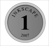
6)here you are, a plain simple coin.
lets make a pile of coins..
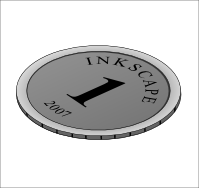
7)Select all the coin objects, rotate it and
shear it vertically to get something like this.
8)Now duplicate the coin border
Give it a grey color fill and
Send it to bottom(object-->bottom or END key)
Now move this with a slight shift downwards.
9)Now duplicate coin border once more and move it out.
We need to create a pattern to fill this.
- Type two | 's followed by two spaces.
- From object menu select pattern--> object to pattern.
Now fill the border with the pattern.
10)Now place this object over the previous coin border as above.
Select all these objects & press ctrl+g to group them.
You have your coin.
11)Duplicate these coins and place them with little shifts
Rotate one of the coin and shear it
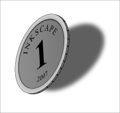
so that it appears like leaning on the pile of coins.
12)Now if you want a shadow effect,
Move out the slant coin
Draw an ellipse and place it below the coin,
give it a grey color with about 70% opacity and 4-5% of blur.
This will be the shadow falling on the pile of coins.
Group both the shadow and coin into one object.
13)Place this(slant coin with shadow) group over the pile of coins
You can also draw another ellipse, dark grey color 100% opacity & no blur.
Place this ellipse object at the bottom to give the sharp shadow.
lots more can be done to this like
-- having a logo in the coin content
-- giving the coin content a shadow, etc.
The tutorial in PNG image format is here and in SVG format is here.
I am not that good at explaining things, especially when its in writing. Hope that you find this tutorial useful. Leave comments if you feel like...
Happy Inkscaping...
Labels: coin, illustration, tutorial


